03 · Brand & creative · Positioning & identity
Saltgrass Day Spa: Building a brand from one feeling
Who the brand is for, what it promises and how it sounds, for a day spa by the water.
Also showsThe :30 campaignContent planning
The short version · 0:57
Prefer to read? Everything in the video is on this page below.
Why brand comes first
Les Binet and Peter Field’s research for the IPA found the strongest long-term results come from splitting the budget roughly 60% brand building and 40% activation. Brand is the half that makes the ask work.
Source: IPA, The Long and the Short of It (Binet & Field, 2013)
Brand strategy
Be remembered before the need shows up.
A coupon brings calls this week. Brand makes people think of you next month, by showing up the same way every time.
So the platform comes first.
Who it’s for
Audience insightThe one who never takes the afternoon
Takes care of everyone else and keeps putting off her day off. Lives near the water. Books on her phone, late at night.
- What she says
- “I’ll do something for myself when things slow down.”
- What she feels
- Permission is the problem, not price.
- What would move her
- An invitation, not a sale. Seeing the calm before she’s asked to book.
- Where she is
- Evening TV and live sports with the family, streaming at night, Instagram and maps on her phone.
She wants permission to stop, not a massage. So we sell the afternoon, not the treatment.
The brand platform
Written before a single shot was picked- Positioning
- For people who need a day off more than they’ll admit, Saltgrass is where the afternoon slows down.
- Promise
- You’ll leave slower than you came in.
- Personality
- CalmWarmUnhurriedUnfussy
- Voice
DoShort, quiet sentences. Invitations, not instructions.
Don’tExclamation points, countdowns, a discount in the headline.
- The line
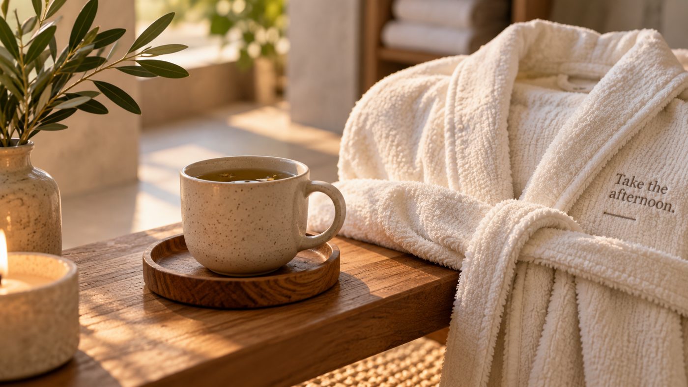
- “Take the afternoon.” It works as a headline, a sign-off and a reason to book.
Brand guidelines
The rules that keep it the same everywhereThe logo
A serif wordmark over a tide line and salt grass. Clear space equals the “S” height. Never stretch it or set it on a busy photo.
Colour
- Deep sea#1F3D38 · text and logo
- Salt grass#9A7B4F · lines and accents
- Shell#F2EDE3 · backgrounds
- Sea glass#C8D5CF · quiet highlights
Type
Instrument Serif for headlines
Hanken Grotesk for everything you need to read quickly: hours, prices, booking.
Photography
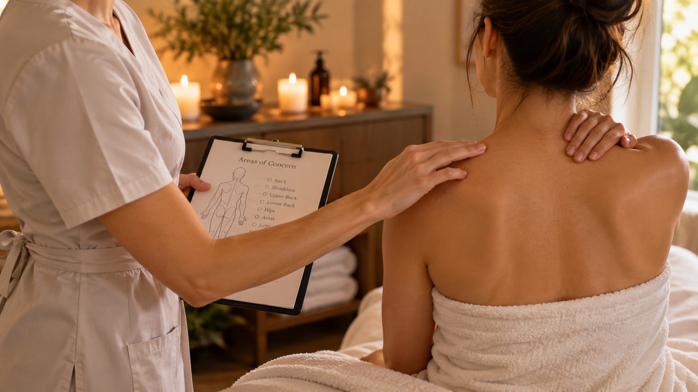
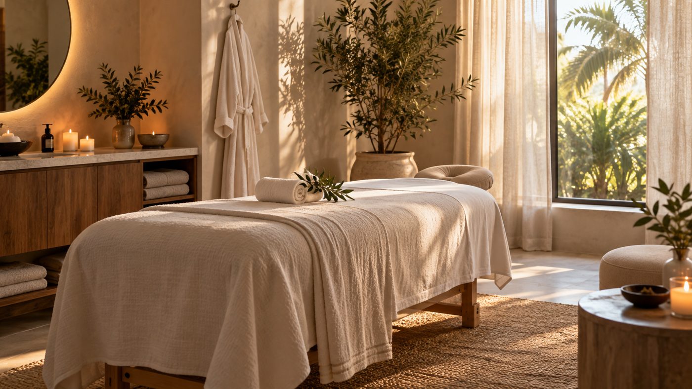
Warm, low light. Hands, water, stone and candles, close and still, never posed.
What this case delivers
A brand the spa owns, before it spends a dollar on media.
- Audience insightWho she is, and the permission she’s waiting for
- Brand platformPositioning, promise, personality, voice and the line
- LogoWordmark and tide-line mark
- GuidelinesColour, type, photography and logo use